Quick Guide
Let's be honest for a second. When you're standing in the shop or scrolling online, the first thing that grabs you about a new pair of skis isn't the camber profile or the turn radius. It's the graphic. That splash of color, that wild pattern, that piece of art plastered across the top sheet. It's what makes you stop and look. It's what makes a ski feel like yours before you've even clicked in.
I remember buying my first pair of "serious" skis. I had the specs down—width, length, flex. But when it came down to two models that performed almost identically on paper, I chose the one with the graphic that made me smile. That connection matters. It's not just vanity; it's part of the skiing experience.
So, you're searching for graphic skis brands. You want something that performs but also says something about you on the lift line. This isn't about listing every brand with a pretty top sheet. This is about understanding the landscape of graphic ski brands, who does what well, and how to make a choice you won't regret after three days on the hill.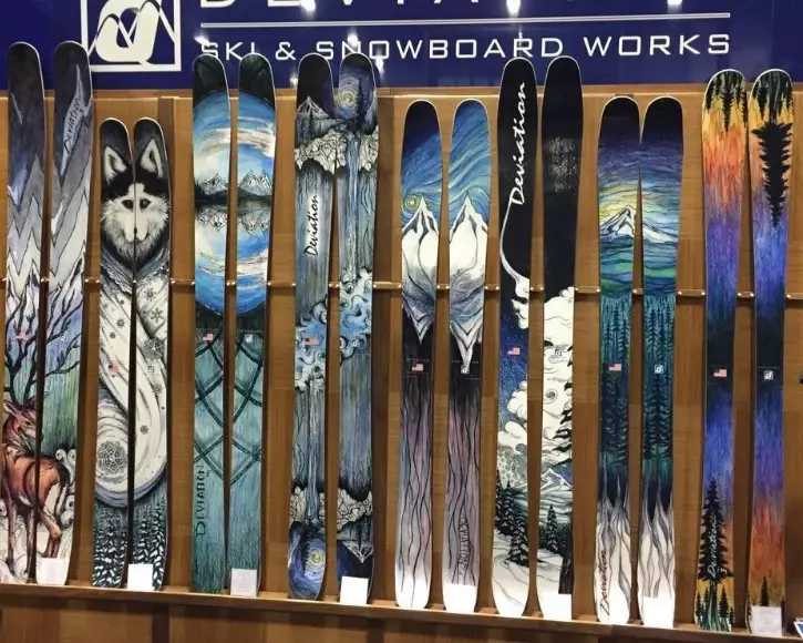
Quick Reality Check: The graphic is the wrapper. What's inside—the core, the laminates, the shape—determines how the ski rides. The best graphic skis brands nail both. A killer design on a noodle of a ski is just a wall decoration. We're going to talk about brands that get this balance right.
Why Do Ski Graphics Even Matter?
If it's just about performance, why do companies spend so much on artists and designs? Simple. Skiing is emotional. The gear is an extension of your personality. A graphic can signal what the ski is about—a dark, aggressive pattern for a charger, a bright, playful mural for a park ski. It builds brand identity and creates a tangible connection with the rider.
Some folks will tell you to ignore the graphic completely. I think that's missing the point. You should absolutely prioritize performance for your style. But if you find a ski that ticks all your technical boxes and you love how it looks, that's a win. That extra bit of stoke is real. The key is not letting the graphic blind you to a ski's flaws.
I've made that mistake. Chased a design onto a ski that was too stiff for my everyday use. Looked great leaning against the wall, felt like a chore on groomers.
The Major Players in Graphic Ski Brands
The market splits into a few camps. You've got the big, established names that treat graphics as a key part of their identity. You've got the smaller, boutique brands where art is the soul of the company. And you've got everyone in between. Let's break down who's who.
The Big Names That Set the Trend
Line Skis: For my money, Line has been the consistent leader in cool, accessible graphics for years. They work with artists like Scott Lenhardt and have a style that's often playful, sometimes retro, always eye-catching. Their Sick Day series graphics are instant classics. You look at a Line ski and you know it. They integrate art into their brand story seamlessly.
Armada ARV: Armada's ARV line (especially the park and all-mountain twins) is a graphic powerhouse. They lean into bold, often geometric or abstract patterns with high-contrast colors. They feel energetic and modern. They're a great example of graphics that match the ski's intent—loud, fun, and built for creativity.
K2 Skis: K2's Mindbender and Reckoner lines often feature cohesive, almost liquid-metal or organic flow graphics. They feel a bit more "mainstream cool" compared to Line's quirky vibe, but they're consistently well-executed. Their collaboration with artists for limited editions is always worth watching.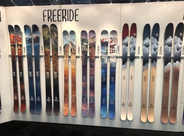
The Boutique & Art-First Brands
This is where things get really interesting. These graphic skis brands often start from a place of art and design, building performance around it.
J Skis: Founded by former Line Skis founder Jason Levinthal, J Skis is essentially a graphic design studio that makes skis. Every model has multiple graphic options (The Master, The Slugger, etc.), often with limited runs. They work with various artists, and the themes range from psychedelic to minimalist. Buying a J Ski is as much about choosing your art as choosing your tool. The quality is top-notch, but you pay for that boutique experience.
Faction Skis: Faction makes this list for their Artist Series, where they collaborate with a single global artist each year to design the entire top sheet line. It creates a stunning, unified collection. The art is usually sophisticated and could hang in a gallery. It's a brilliant concept that makes their skis instantly collectible. Performance-wise, they're serious tools, so you're not sacrificing function.
ON3P: A darling of the ski forum world, ON3P from Portland, Oregon, has a cult following. Their graphics are often aggressive, featuring animals, mythical creatures, and bold typography. They look indestructible because, well, the skis are built like tanks. Their graphic style screams "built here, ridden hard." It's a specific, Pacific Northwest vibe that resonates deeply with their audience.
What about the giants like Rossignol or Atomic? They have great seasons and quieter seasons. They often use more technical-looking graphics—carbon weaves, geometric patterns that hint at the tech inside. They can be stunning, but they sometimes lack the narrative punch of the boutique brands.
How to Actually Choose: A Real-World Buying Guide
Alright, so you're inspired. How do you navigate this world without getting burned? Let's move past the hype.
Step 1: Performance First, Always. Lock down your ski type first. What's your ability level? Where do you ski most (ice coast groomers, Utah powder, park)? Do you want a playful twin-tip or a directional charger? Narrow your search to skis that fit your functional needs. The coolest graphic in the world won't make a 115mm-underfoot powder ski fun on hardpack if that's your daily driver.
Use resources like the detailed ski reviews on Blister Review to get deep, performance-focused insights. They test relentlessly and their reviews are gospel for cutting through marketing speak.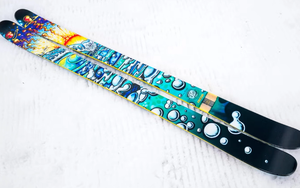
Step 2: Graphic as a Tie-Breaker & Mood-Setter. Now, within that performance category, look at the graphic skis brands that speak to you. Does the graphic match the ski's personality? A muted, classy graphic on a freestyle noodle might feel off. A loud, chaotic design on a precision GS ski might too. Let the graphic reinforce what the ski is for.
This is where looking at the full range of a brand helps. Most graphic skis brands have a visual language. See if it gels with you.
Step 3: Consider Longevity & Durability. That beautiful matte finish or delicate line drawing? Ask how it will look after a season of abuse. Some top sheet materials and printing processes hold up better than others. A high-pressure laminate will resist scratches better than a simple sublimated print. This is a hidden factor where premium brands often justify their price.
I learned this the hard way with an early-generation printed top sheet. One run through a branch and it looked like it had been attacked by a cat.
Step 4: Think Resale (Be Honest). Love it or hate it, a polarizing graphic can be harder to sell later. A timeless or widely loved design holds value better. If you buy a wild, limited-edition graphic, you might be committing for the ski's full life.
Side-by-Side: A Quick Comparison of Graphic Focus
To help visualize the differences between some of these top graphic skis brands, here's a snapshot.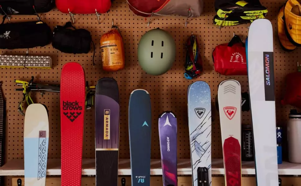
| Brand | Graphic Style Vibe | Typical Art Approach | Best For The Rider Who... | Price Note |
|---|---|---|---|---|
| Line Skis | Playful, Retro, Accessible Cool | In-house & collaborator artists, thematic series | Values fun, approachable style and proven all-mountain performance. | Mid to High Range |
| J Skis | Boutique, Artistic, Multiple Options | Core to brand identity. Multiple artist collabs per model. | Wants a unique, collectible piece of art that's also a premium ski. | Premium (You pay for the art/process) |
| Faction (Artist Series) | Sophisticated, Unified, Gallery-Worthy | Single featured artist designs the entire annual collection. | Appreciates high-concept art and wants a cohesive, statement-making quiver. | High Range |
| Armada ARV | Bold, Energetic, Modern | Bold colors, geometric patterns, designed for high visibility. | Lives in the park & all-mountain freestyle, wants a loud, energetic look. | Mid Range |
| ON3P | Aggressive, Durable, Pacific NW | Iconic animals/creatures, bold logos, built-to-last aesthetic. | Prioritizes insane durability and a rugged, no-nonsense image. | Premium |
See? It's not just "which looks pretty." It's about aligning with a brand's entire ethos.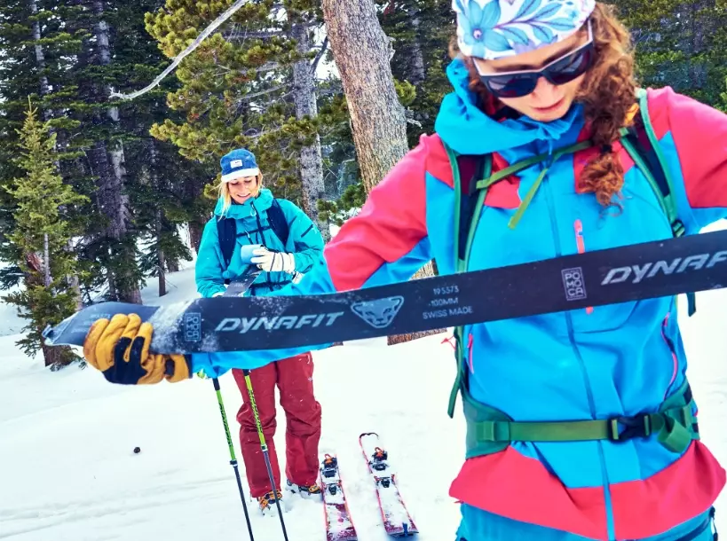
Maintaining Your Moving Artwork
You've invested in a great graphic. Protect it. A basic ski maintenance routine goes a long way.
- Storage: Don't leave them graphic-side-down on abrasive surfaces. Use a wall rack or store them vertically, separated.
- Transport: A simple ski bag is the best investment for travel. Even a cheap one prevents gashes from airport conveyors.
- Cleaning: Just a damp cloth to wipe off dirt and road salt. Avoid harsh chemicals that can fade the print.
- Minor Scratches: A permanent marker in a matching color can touch up small topsheet scratches. It's not perfect, but it helps.
For the deep technical stuff on ski construction and care, the GoSki network has some solid, practical advice that's less brand-specific and more user-focused.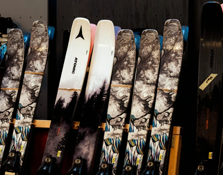
Answering Your Burning Questions
Wrapping It Up: What Really Matters
At the end of the day, searching for the best graphic skis brands is a search for a tool that inspires you. It's a perfectly valid way to engage with the sport. The brands that lead in this space understand that skiing is a blend of hard data and pure feeling.
My final, unfiltered take? Don't get so lost in the art that you buy the wrong tool. But once you find the right tool in the right category, absolutely let the graphic be the deciding factor. That joy you get when you look down at your skis in the lift line is part of the experience you're paying for. The best graphic skis brands deliver that joy without compromising what's under your feet.
Start with performance. Educate yourself on the specs and reviews. Then, dive into the world of artists and designs that these innovative graphic skis brands are putting out there. The perfect pair is the one you can't stop thinking about, both for how it will carve and how it looks resting in the snow.
Now go find them.